
So, What is Responsive Web Design/RWD?
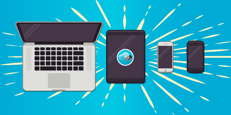
It’s a design format that ensures a website will look great on any viewing device, whether it be a tablet, smartphone, or desktop. With the use of HTML and CSS, RWD resizes and modifies website content so that the layout will aesthetically make sense on different screen sizes and various web browsers.
Your website may be stunning on a 1366X768 desktop screen, but if it doesn’t reformat automatically to accommodate the screen size of your smartphone or tablet, you have a problem. The majority of people are checking out websites on their tiny portable devices these days, and this is precisely why responsive web design is absolutely necessary.
What About Mobile Design?
Mobile websites are considered independent from their main websites, they’re a subset of what you would find on a desktop. They typically have a separate URL (i.e. m.site.com) and consist of features or content that suit mobile devices, which are not meant to be viewed on a desktop. However, this design route is dated. Why not have everything under one domain? That’s where RWD comes in handy!
Responsive Web Design Just Makes Sense + Here’s Why:
Fluid Navigation
You want to ensure your visitors are satisfied and encounter a fluid experience when they visit your website and RWD allows this, while accommodating every user, regardless of what device is being used. The last thing you ever want is for a visitor to never return to your site because they were confused while attempting to navigate it.
Quick Load Times
According to Google’s PageSpeed Insights, your entire page should take no more than 2 seconds to load on a desktop and no more than one second on a mobile device. You can test your site’s performance here. A website that was only built for a desktop will load much slower than the recommended speeds and increases chances for a visitor to abandon your site before the loading even completes. No bueno! RWD resolves that issue. Muy bueno!
Improves SEO
Google recommends RWD when it comes to mobile web design. Improved user experience equals improved search rankings. Plus, because RWD only requires one URL, versus mobile design using a separate URL, Google’s search algorithms will love you for it. Who doesn’t want to improve their website’s SEO and get on that first page?
Responsive Web Design is a no brainer – it adapts to multiple screen sizes, continues to evolve with the latest gadgets, such as smartwatches, and it only requires one URL to maintain. If your web developer is not designing from this approach, run for the hills! Or, just contact us, we would never dare not to design responsive websites – it’s not the Cloud3 way.