FINAL
ALTERNATE
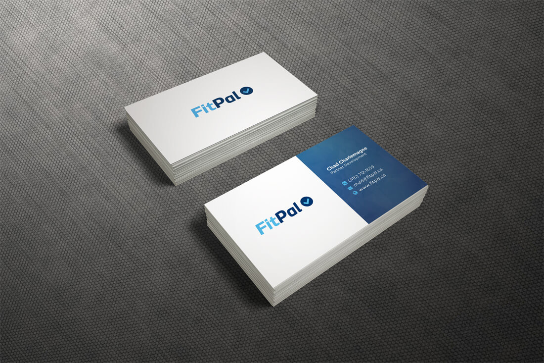
Premium Business Cards
FitPal’s entire company revolves around one key word: Simple. Their mission statement is simple. Their scheduling system is simple. Their processes are simple. With that in mind, we even had to make their logo simple. With their business card being an extension of their brand and the first thing their prospects see, that also had to be simple.
Simple can still be creative. So, we decided to add a subtle backdrop on the backside of the card for some added flair. We opted to produce this card on our premium matte/dull card stock, which is different from the typical matte lamination. Due to the extremely simple design, we finished the card with 1/8 inch rounded corners for a touch of sophistication and added creativity.
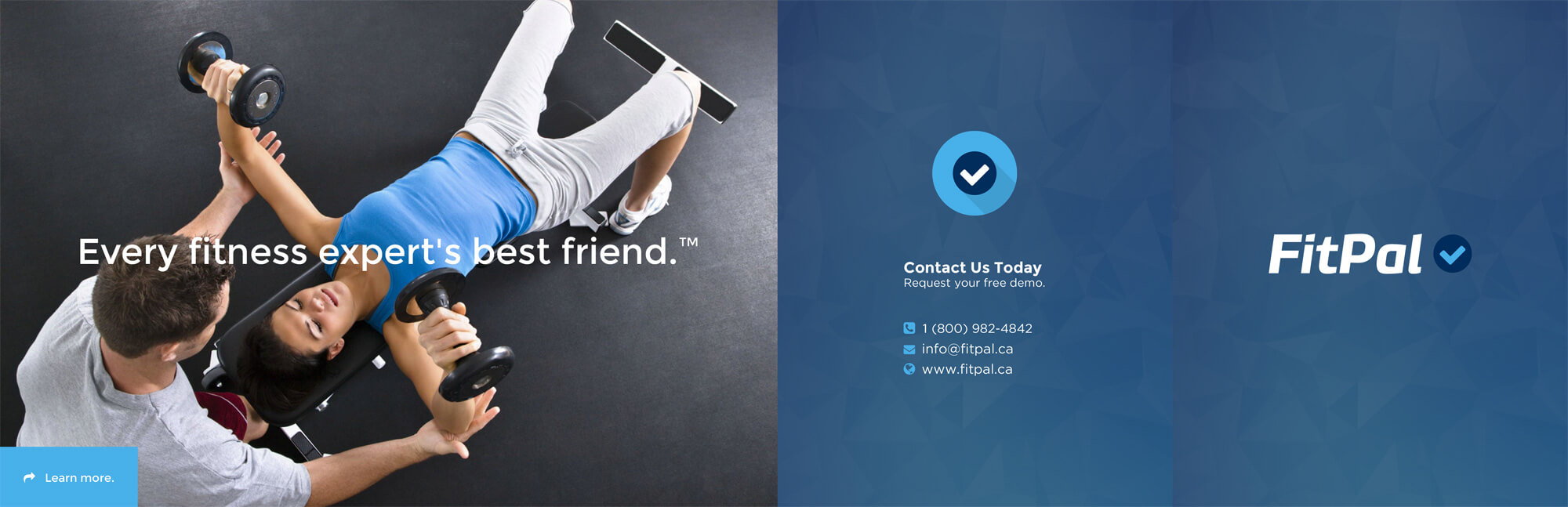
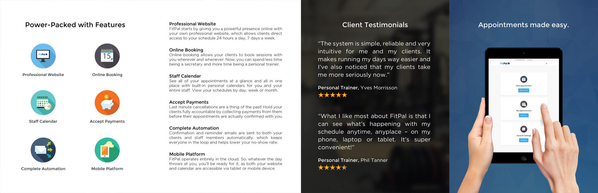
Promotional Brochure
Part of FitPal’s marketing campaign was comprised of a local mail out and sales initiative. So, we created a custom brochure design with a roll-fold to pack all of their features inside while still sticking to the “simple” theme.
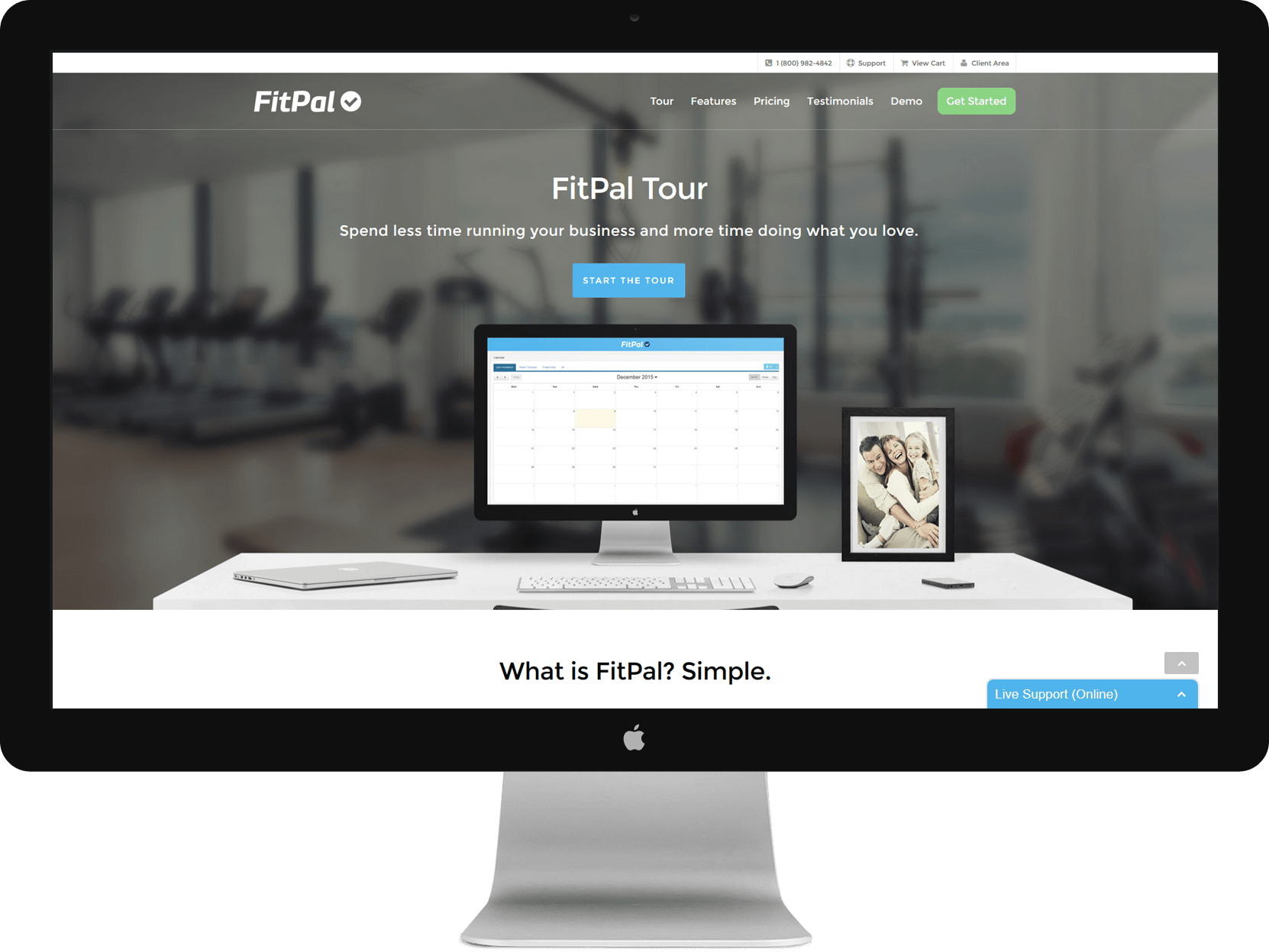
Website Design
Simple meets covert sophistication. The FitPal website is a highly complex website built into a simple, user-friendly costume. There’s form, there’s function. Visit the website and see just what we mean. Enough chit-chat already.